A new identity that speaks to empowering families
A leading child and family service agency needed a new identity system that showcased their transformed purpose and goals.
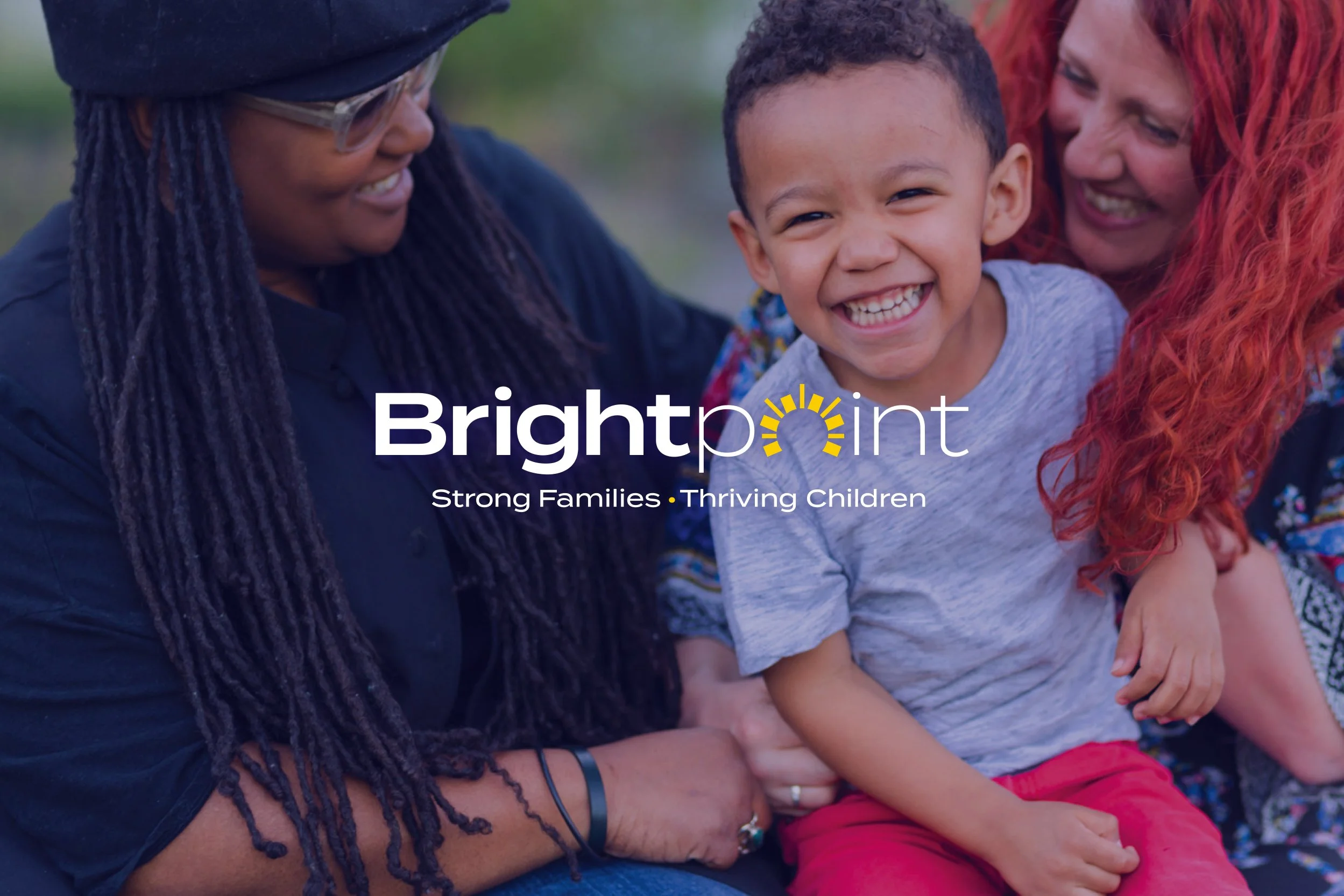
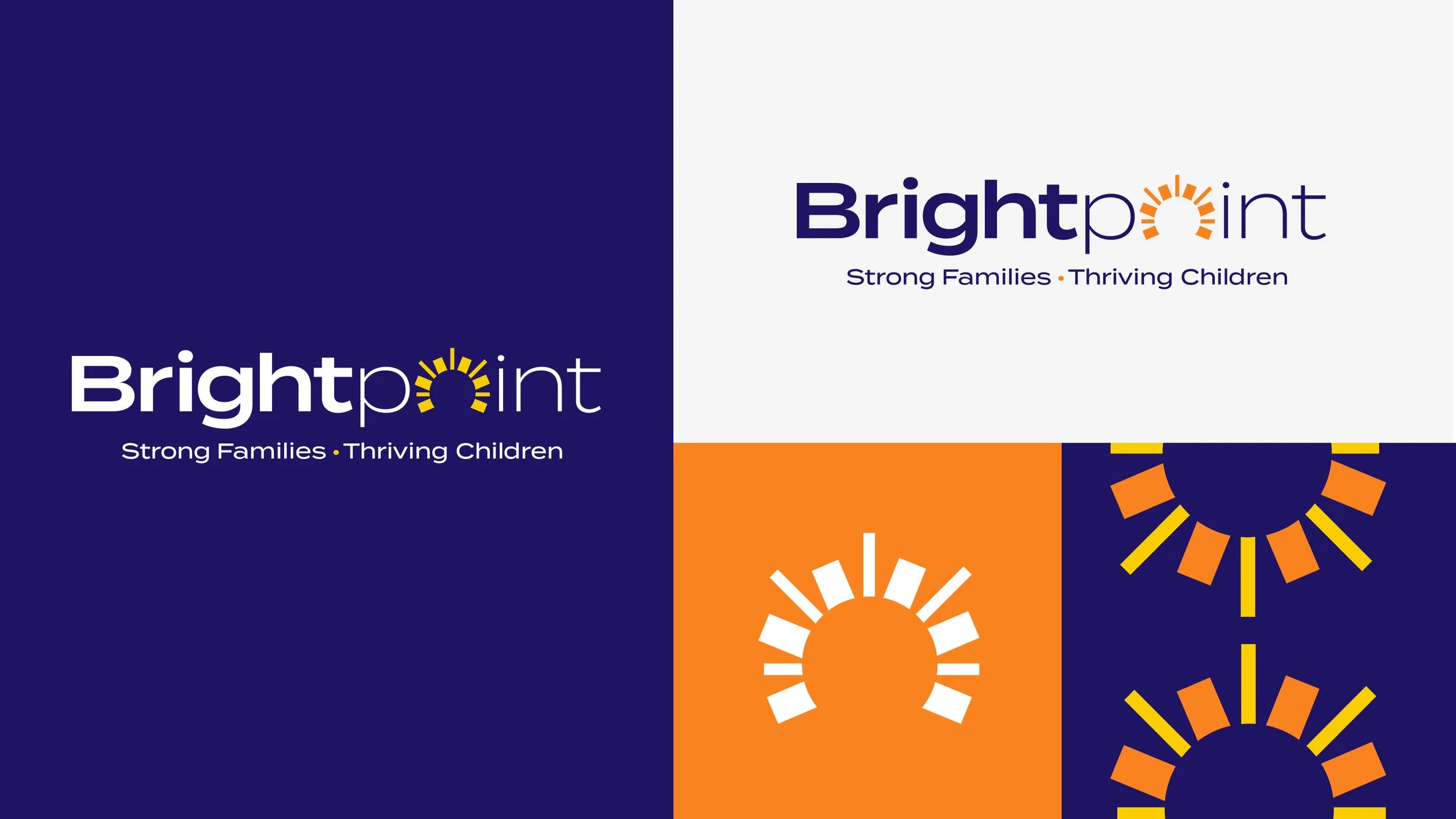
The mark speaks to an emboldened outlook: one that highlights the “bright” in one’s journey.
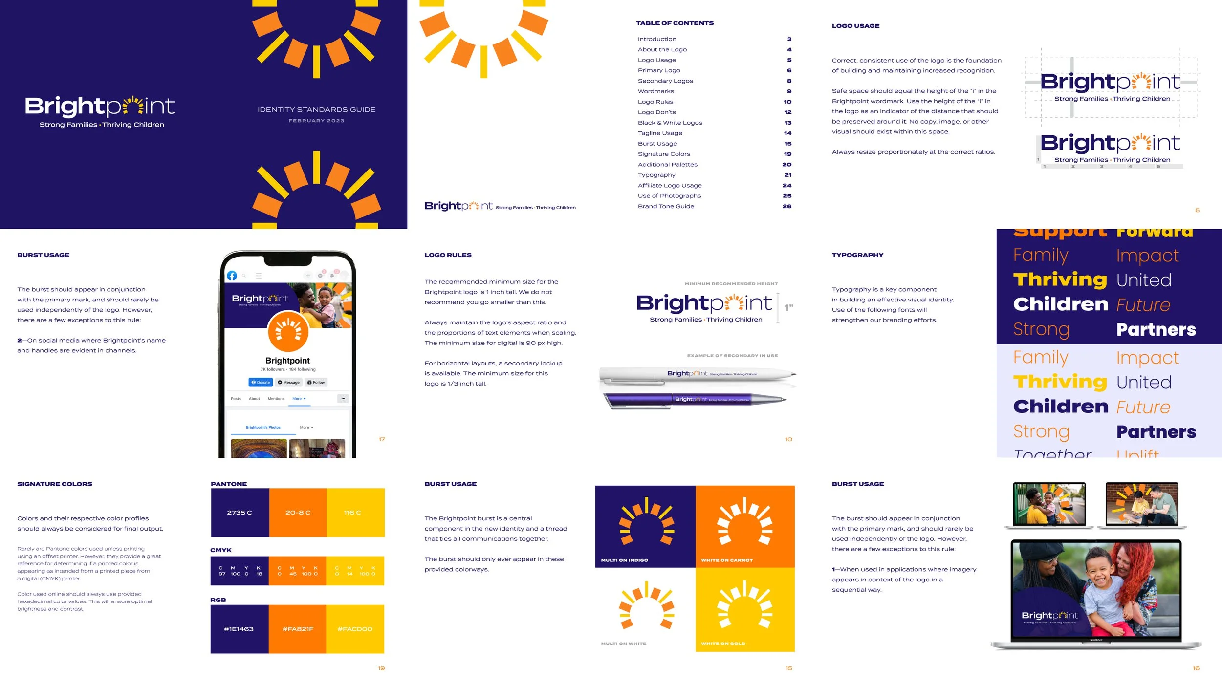
That symbolism and metaphor are carried through all the visual elements of the new system, including guidelines.
Powerful
〰️
Compassionate
〰️
Straightforward
〰️
Optimistic
〰️
Powerful 〰️ Compassionate 〰️ Straightforward 〰️ Optimistic 〰️
Inclusion in the design process was important. We worked to get buy-in from 800+ employees & trustees on the rebrand.

Logos & Lock-ups
〰️
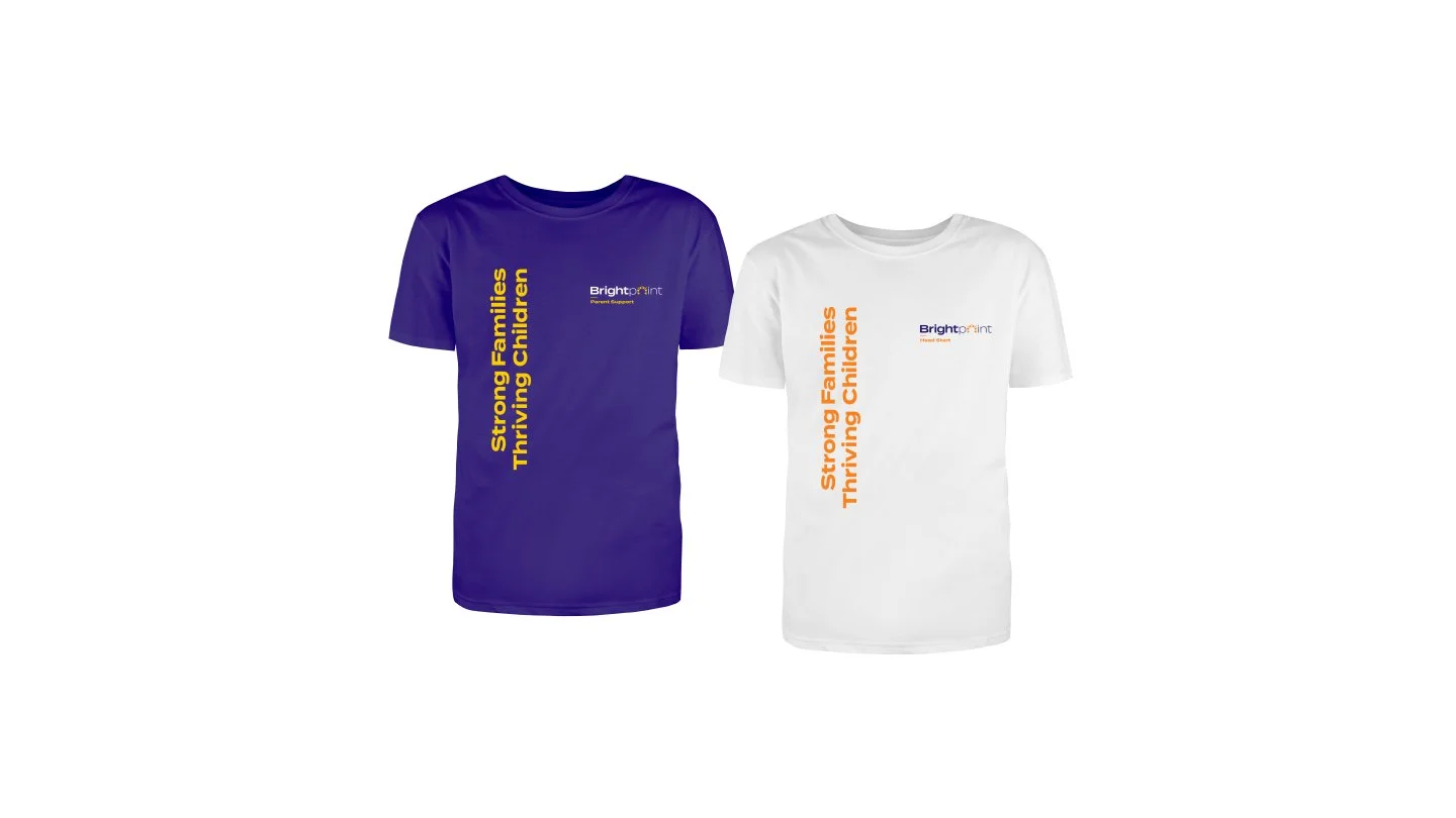
Collateral
〰️
Signage
〰️
Communication Templates
〰️
Logos & Lock-ups 〰️ Collateral 〰️ Signage 〰️ Communication Templates 〰️
My Role: Logo development, Design and Art Direction
-
Work done as part of the Truth Collective team.